An AI-powered ATS that simplifies shortlisting, tagging, and workflows - built for fast, scalable, and collaborative hiring.
Landing Pages
Copyright © 2026|hiremore AI
An AI-powered ATS that simplifies shortlisting, tagging, and workflows - built for fast, scalable, and collaborative hiring.


The average ATS demo shows off 40+ features, and post-purchase usage data tells a brutal story: most teams actively use fewer than half of them. This ATS buyer’s guide exists to fix the way features get evaluated, because an applicant tracking system is bought on the long checklist and lived in on about eight capabilities.
An applicant tracking system (ATS) is the software backbone of recruitment: it stores candidates, manages requisitions and pipelines, and coordinates everyone involved in hiring. Choosing one is a 3-to-5-year commitment for most companies.
This guide is for hiring leaders, TA ops, and founders comparing platforms. You’ll get the 8 ATS features that decide whether the purchase succeeds, the table stakes every serious vendor has, the demo-bait you can ignore, and a weighting method that turns your pain points into a scorecard.
- Eight ATS features decide most purchase outcomes: workflow configurability, automation rules, reporting, integrations, candidate experience, search, compliance tooling, and day-to-day usability.
- Teams actively use fewer than half the features they buy; paying for the unused half is how ATS contracts end up 30 to 50% overpriced for actual usage.
- The right evaluation method starts from your 5 biggest hiring pain points and weights features by how directly they fix them, not from a vendor’s feature list.
- Recruiter usability compounds daily: a clunky ATS used 4 hours a day costs more in lost productivity than the license fee. Demo with your real workflows, not the vendor’s script.
- Reporting quality varies more than any other feature across platforms. If you can’t reproduce your 5 core hiring metrics in the demo environment, believe what you see.
An applicant tracking system is the database and workflow engine of recruitment, storing candidates, managing pipelines, and coordinating hiring teams. What you’re really buying is three things: a workflow engine, a data layer, and a daily user experience.
The framing matters because vendors sell features, but teams live in workflows. The same “interview scheduling” checkbox can mean a clunky 6-click process or a genuinely automated one. The same “reporting” checkbox can mean canned PDFs or a real analytics layer.
So this ATS buyer’s guide evaluates capability depth, not checkbox presence. The three layers you’re actually purchasing: the workflow engine (how hiring stages, approvals, and automations are configured), the data layer (how candidate data is stored, searched, exported, and reported), and the experience layer (what recruiters, hiring managers, and candidates touch daily).
Weakness in any layer eventually becomes a daily tax. The skill in buying is figuring out which layer your team will stress hardest.
Prioritization matters because feature count is a decoy: the platforms with the longest lists are rarely the ones teams thrive on, and unused features quietly inflate both price and complexity.
There’s a predictable failure pattern in ATS buying. A committee builds a 60-row requirements spreadsheet where every row weighs the same. Vendor A checks 54 boxes, Vendor B checks 49, Vendor A wins. Eighteen months later the team is fighting Vendor A’s terrible search and rigid workflows daily, while the 12 features that won the deal sit untouched.
The economics back this up. Teams that audit post-purchase usage typically find under 50% of licensed features in active use. That unused half isn’t free: it’s priced into the contract, it complicates the UI, and it lengthens implementation.
The alternative is weighting by pain. A team drowning in scheduling chaos should weight automation 5x. A team that can’t answer “where do our hires come from?” should weight reporting 5x. Same market, different right answers.
📊 Key Stat: Across published user-review aggregates, reporting and ease of use are the two most commonly cited regrets in negative ATS reviews, while missing niche features barely register. Buyers consistently overweight breadth and underweight depth.
The decisive eight are workflow configurability, automation rules, reporting and analytics, integration ecosystem, candidate experience, search, compliance tooling, and recruiter usability, because these are the capabilities teams touch daily and outgrow fastest.
Workflow configurability. Can you model your hiring stages, approvals, and role-family variations without vendor services? Test: configure your weirdest workflow live in the demo. If it takes a services engagement, it’ll take one every time you change.
Automation rules. Stage-triggered emails, scheduling links, task assignments, SLA nudges. This is where 5 to 10 weekly recruiter hours hide. Test: build “when candidate enters stage X, send Y and create task Z” yourself, in the demo.
Reporting and analytics. Funnel conversion, time to fill, source effectiveness, without exporting to spreadsheets. Test: reproduce your 5 core metrics in the demo environment using realistic data. This single test eliminates more vendors than any other.
Integration ecosystem. Native, supported, bidirectional connections to your HRIS, calendar, assessment tools, and job boards. Logos on a partner page are not integrations. Test: ask for the documentation and a reference customer using your exact stack.
Candidate experience. Mobile-complete applications in minutes, resume prefill, status visibility. Application abandonment commonly hits 60%+ on long forms, so this feature class directly feeds your funnel volume.
Search. Finding the silver-medalist from last spring is how you fill roles for free. Test: seed the demo with 50 resumes and run real searches. Search quality varies shockingly between platforms.
Compliance tooling. EEOC/OFCCP reporting where applicable, GDPR consent and retention rules, audit trails, and bias-audit support if AI features are in play. Painful to retrofit, cheap to buy upfront.
Recruiter usability. Clicks per common action, page speed, bulk operations. A recruiter does these motions hundreds of times daily; friction compounds into hours. Test: have your busiest recruiter drive the demo for 30 minutes.
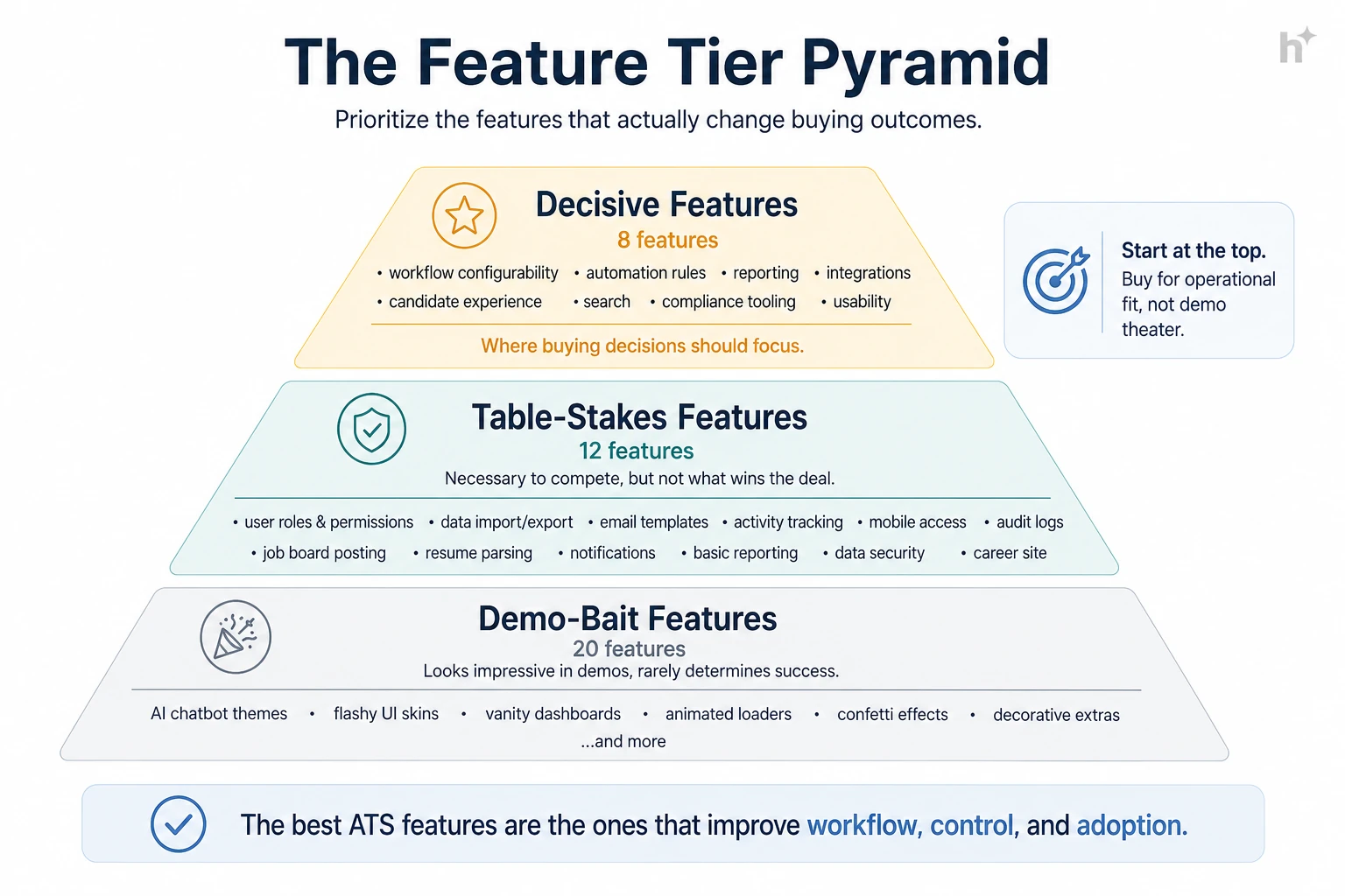
| Tier | Features | Buying Posture |
|---|---|---|
| Decisive 8 | Workflows, automation, reporting, integrations, candidate UX, search, compliance, usability | Weight heavily, test live |
| Table stakes | Parsing, posting syndication, interview kits, e-signature, templates, mobile app, SSO, roles/permissions | Verify present, don’t differentiate on them |
| Demo bait | Niche AI widgets, internal branding themes, features for teams 10x your size | Ignore in scoring |
💡 Pro Tip: Insist on a sandbox loaded with your own sample data for a week. Two hours of unsupervised clicking by your recruiters reveals more than four scripted demos.
Build the scorecard from your pain points: list your top 5 hiring problems, map each to the features that fix it, weight by severity, and score vendors only on what’s weighted.
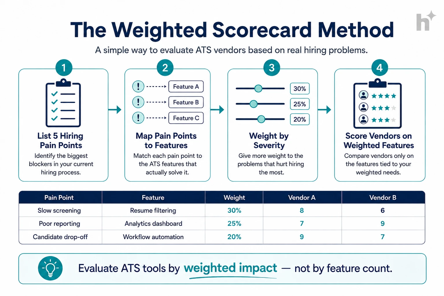
Input: 30 minutes with your recruiters and 2 hiring managers.
Process: List the 5 things that genuinely hurt: “scheduling eats our week,” “we can’t report source of hire,” “hiring managers won’t log in.” Rank by cost in hours or lost candidates.
Output: A ranked pain list that becomes your evaluation spine.
Input: The pain list.
Process: Translate each pain into the feature depth that fixes it. “Scheduling eats our week” maps to automation rules + calendar integration depth. “Managers won’t log in” maps to usability + email-native approvals.
Output: A short feature list with a reason attached to every row.
Input: The mapped list.
Process: Assign weights (pain #1 features get 5x, pain #5 gets 1x). Score each vendor 1 to 5 per feature, from live tests only, never from the proposal PDF. Multiply and sum.
Output: A ranked vendor list your whole committee can argue with productively, because every number traces to a tested observation.
Input: Your top vendor and one reference customer of similar size and stack.
Process: Ask the reference your pain-point questions specifically: “how long did your weirdest workflow take to configure?” “can you actually report source of hire?”
Output: Confirmation or a flag, before signature rather than after.
The single highest-impact practice is testing with your own workflows and data during evaluation, because every regret in ATS buying traces back to discovering reality after go-live.
Demo your workflows, not theirs. Before: vendors run a polished script and everything looks effortless. After: you bring three real requisitions and your messiest approval chain; capability gaps surface in minutes instead of months.
Let recruiters drive. Before: leadership evaluates, recruiters inherit, adoption suffers. After: your two busiest recruiters get sandbox access and a veto. Teams that do this report dramatically smoother rollouts.
Reproduce your reports. Before: “yes, we have reporting” turns out to mean canned PDFs. After: your 5 core metrics rebuilt live in the demo, or the vendor exits the process.
Negotiate the exit before the entrance. Before: data export at contract end costs five figures and arrives as unusable dumps. After: export format, cost, and timeline are contract clauses signed at purchase, when your leverage peaks.
Price 3 years of growth. Before: per-seat pricing looks fine until you double headcount and add modules. After: you price the contract at projected year-3 scale and negotiate tiers now.
| Condition | Recommended Action | Expected Outcome |
|---|---|---|
| Under 100 hires/year, simple workflows | Mid-market platform; weight usability + automation | Fast adoption, low overhead |
| Scaling fast, multiple role families | Weight workflow configurability 5x | No re-platforming in 18 months |
| Analytics-driven leadership | Weight reporting 5x; test with real data | Metrics without spreadsheet exports |
| Heavy existing tool stack | Weight integrations 5x; reference-check your stack | No shelfware, no swivel-chair work |
⚠️ Watch Out: The most expensive sentence in ATS buying is “we’ll configure that after go-live.” Anything not demonstrated live during evaluation should be assumed not to work the way you imagine. Test it now or budget for the surprise.
The most common challenge is committee paralysis: six stakeholders, sixty requirements, and no shared definition of what matters most.
When every stakeholder’s list merges, the scorecard flattens and feature count wins again. Solution: force-rank pains before features enter the conversation, and cap the weighted scorecard at 15 rows. Scarcity produces honesty.
Scripted demos are engineered to look identical. Solution: send vendors your scenarios 48 hours ahead and grade execution. Refusals and deflections are data.
Implementation fees, integration connectors, support tiers, and API limits appear after verbal commitment. Solution: request the full rate card in round one and build a 3-year total cost model per vendor. Expect year-one totals 1.5 to 2x license.
Switching fear keeps teams on platforms they’ve outgrown. Solution: quantify the status quo tax (hours lost weekly to friction × loaded recruiter cost) and compare it to a one-time migration estimate. The math usually argues for moving sooner than instinct does.
Pain-weighted buying consistently beats feature-count buying, and the difference shows up in adoption and time-to-value within two quarters.
Logistics company, 300 hires/year. Problem: chose their previous ATS on a 58-row checklist; two years later, scheduling still ran on spreadsheets because the automation that demoed well couldn’t handle multi-site interview panels. Intervention: re-bought using a pain-weighted scorecard with automation weighted 5x and live-tested on their panel scenario. Measured outcome: scheduling time dropped 70%, and the new platform cost 15% less because they stopped paying for three unused modules.
SaaS scale-up, doubling headcount. Problem: outgrew a lightweight ATS; workflows for engineering vs sales hiring couldn’t diverge. Intervention: weighted workflow configurability and reporting 5x, ran two-week sandboxes with real requisitions for the finalists. Measured outcome: went live in 9 weeks, 92% weekly recruiter adoption at 60 days, and their first reliable source-of-hire report ever.
Nonprofit network, compliance-constrained. Problem: grant-funded roles require OFCCP-style documentation their old system couldn’t produce, consuming 6 hours per audit request. Intervention: weighted compliance tooling and audit trails heaviest, validated with a reference in the same funding environment. Measured outcome: audit response time fell from 6 hours to 20 minutes, and the team reclaimed roughly one workweek per quarter.
💡 Pro Tip: The logistics case is the cautionary tale worth retelling: the feature existed, the depth didn’t. Checkbox-level evaluation can’t see that difference. Live scenario testing can.
The most telling post-purchase metric is weekly active usage by recruiters and hiring managers, because an ATS that people route around delivers nothing regardless of its feature list.
Weekly active usage. Definition: share of intended users genuinely working in the system weekly. Calculation: weekly actives ÷ licensed users × 100, split by recruiters and hiring managers. Target benchmark: 90%+ recruiters, 70%+ hiring managers by day 90.
Time to fill (before vs after). Definition: end-to-end speed change attributable to the platform. Calculation: median days, same role families, 2 quarters pre vs post. Target benchmark: 10 to 20% improvement once automations are live.
Scheduling cycle time. Definition: hours from “schedule interview” decision to confirmed slot. Calculation: timestamp delta, averaged monthly. Target benchmark: under 24 hours with automation; many teams start at 3+ days.
Report self-service rate. Definition: share of recurring metric requests answered inside the ATS without exports. Calculation: self-served reports ÷ total report requests. Target benchmark: 80%+; below that, the reporting layer failed its demo promise.
Application completion rate. Definition: candidates finishing applications ÷ starts; the candidate-experience scoreboard. Calculation: ATS funnel data, by device. Target benchmark: 70%+ overall, with mobile within 10 points of desktop.
| Metric | What It Measures | How to Calculate | Target Benchmark |
|---|---|---|---|
| Weekly active usage | Real adoption | Actives ÷ licensed | 90% recruiters / 70% HMs |
| Time to fill delta | Business impact | Median pre vs post | 10 to 20% better |
| Scheduling cycle | Automation payoff | Decision-to-confirmed hours | < 24 hours |
| Report self-service | Analytics reality | Self-served ÷ requested | 80%+ |
| Application completion | Candidate UX | Completions ÷ starts | 70%+, mobile close to desktop |
The highest-severity risk is buying for the org you wish you were: enterprise platforms bought by 50-person companies produce complexity tax without the scale that justifies it.
Over-buying. Enterprise-grade configurability at startup scale means months of implementation for workflows you could have had out of the box. Match platform weight class to hiring volume honestly.
Under-buying with growth ahead. The inverse: a lightweight system at 50 hires/year becomes the bottleneck at 300. Price the 3-year trajectory, not the current quarter.
Migration data loss. Sloppy migrations orphan historical candidates and break compliance trails. Insist on a migration plan with field mapping and a validation sample before cutover.
Contract lock-in. Multi-year deals signed for discounts before the platform proved itself in production. Take the 1-year term with renewal pricing protection instead.
⚠️ Watch Out: If a vendor’s best argument is the length of their feature list, that’s the tell. Depth on your eight, not breadth across forty, is what you’ll live with every day for the next three years.
The ATS category is converging with AI-native hiring platforms: automation and intelligence are moving from add-on modules into the core, and buyers should weight platform AI architecture accordingly.
AI-native cores. Screening, ranking, and scheduling intelligence are becoming platform-level capabilities rather than bolted-on modules, and the difference shows in coherence: one explainability model, one audit trail, one data layer.
Skills-based data models. Platforms are restructuring candidate data around skills rather than job titles, which improves matching and internal mobility reporting. Ask vendors how their data model handles skills, and whether it maps to a recognized taxonomy.
Compliance as a product surface. With bias-audit laws spreading, expect audit dashboards, notice workflows, and four-fifths monitoring to become standard ATS features rather than legal afterthoughts. Buyers in regulated markets should weight this now.
Eight feature classes decide most outcomes: workflow configurability, automation rules, reporting, integrations, candidate experience, search, compliance tooling, and recruiter usability. For growing companies specifically, workflow configurability and reporting matter most because they’re the features you outgrow first.
Start from your 5 biggest hiring pain points, map each to the feature depth that fixes it, weight by severity, and score vendors only on those weighted rows, using live tests rather than proposal claims. Cap the scorecard at 15 rows. Feature-count comparisons reward breadth; weighted scorecards reward fit.
Mid-market platforms typically run $5,000 to $50,000+ annually depending on seats and hiring volume; enterprise suites go well beyond. Budget year-one totals at 1.5 to 2x license once implementation, integrations, and training are included, and model 3 years at projected headcount before comparing prices.
Lightweight platforms: 2 to 6 weeks. Mid-market with integrations and migration: 2 to 4 months. Enterprise: 4 to 9 months. The biggest variable is your side, not the vendor’s: decision speed on workflows, data cleanup, and stakeholder availability move timelines more than software does.
Include, yes; decide on them, carefully. AI scheduling and screening assistance deliver clear time savings. For anything touching decisions (ranking, auto-rejection), apply the same explainability and bias-audit standards you’d apply to a standalone AI tool, because regulations like NYC Local Law 144 apply regardless of whether the AI lives inside your ATS.
When the status quo tax exceeds migration cost: quantify weekly hours lost to friction and workarounds, multiply by loaded cost, and compare to a one-time migration estimate. Teams typically find the math favors switching 6 to 12 months before they emotionally accept it.
The honest version of every ATS buyer’s guide fits in a sentence: depth on the eight features you’ll live in beats breadth across forty you won’t. Weight by pain, test live with your own workflows and data, let recruiters drive, and negotiate the exit at the entrance.
The tradeoff is upfront effort: a pain-weighted evaluation takes a few weeks longer than picking the longest checklist. It’s also the difference between an ATS your team thrives on for five years and one they route around for three.
If modern ATS features with AI built into the core, explainable screening, automated workflows, real reporting, are on your weighted list, take a look at the hiremore AI platform and bring your messiest workflow to the demo. That’s the test we like.
Ready to hire smarter?
Build structured pipelines, screen candidates with AI, and keep your team aligned from first application to final offer.
